Web design is a complex craft that takes time to perfect. It’s also a field changing at lightning speed as technology advances, making it a massive challenge to keep up.
Although many business owners are aware of the importance of website design, it’s a subject that only designers understand. If you want a professional website design, you must first understand the fundamentals to express what you desire.
Even if you’re hiring a good website designer for you, you still need some background information to distinguish a talented one from a mediocre one and explain what you need them to do.
We understand how difficult it is for non-designers to grasp the fundamentals of web design; therefore, we’ve put up this informative article to get you started. Whether you’re employing a designer or creating your website, make sure to include these web design tips:
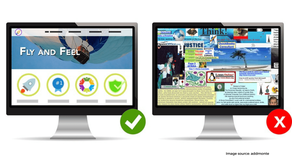
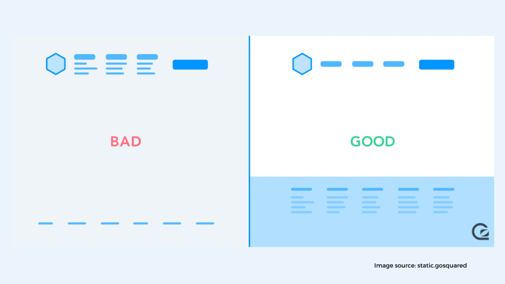
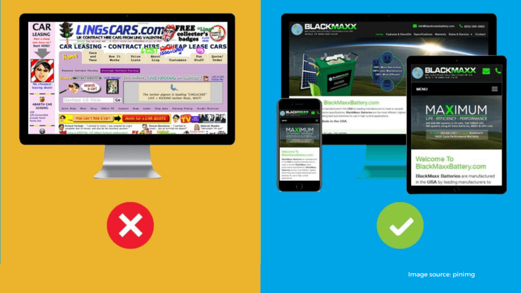
First, let’s talk about one of the most common mistakes in web design: a cluttered screen. Most individuals develop a list of all they want on their website without realizing it, and they just paste everything on there—and on the same page.
Essentially, each component you add to your website design dilutes the others. As a result, a cluttered interface will confuse your user and cause them to lose sight of the overall goal.
In contrast, limiting yourself to just the required components is more effective since they do not compete for attention.
Successful websites feature other information, of course, but present it later, so their screens are never too crowded. It’s the visual equivalent of pacing.
A web design must be streamlined to be successful. There must be a clear route or routes for the user to follow. The goal of decluttering is to make more room for crucial information by trimming nonessential elements.
There are numerous methods to do this (some of which are described below), but the first step is always to create space for key details by eliminating low-priority ones.
Do:
Don’t:
How will you fill the empty room you’ve created after eliminating the clutter? Filling it with nothing might be a good idea.
In web design, negative space (a.k.a. white space) is the technical name for spaces in an image that don’t attract attention in the visual arts.
Typically, they’re barren or unoccupied, such as a cloudless sky or a neutral background. While negative space might be rather dull on its own, when employed artistically, it may complement and enhance the primary subject, improve legibility, and make the message easier to “take in.”
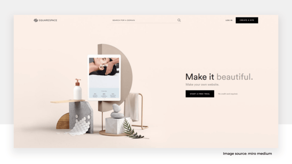
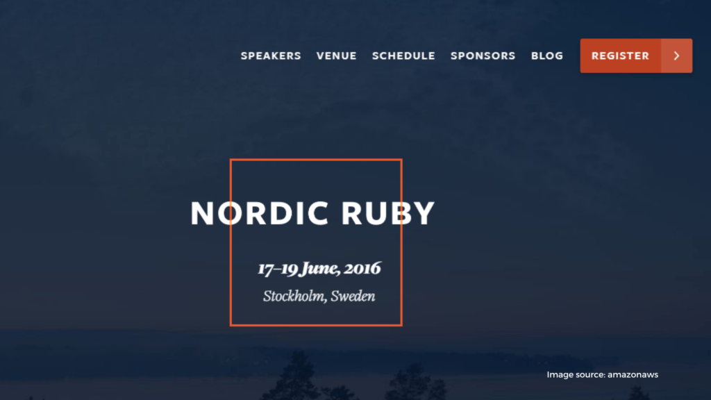
For example, the tagline and calls to action (CTA) take the main focus, not because they’re flashy or tacky, but because of all the negative space around them.
The landing page should clarify what the firm does and where visitors may go next on the site in a minimalistic way—a clever composition with plenty of tactical negative space.
Do:
Don’t:
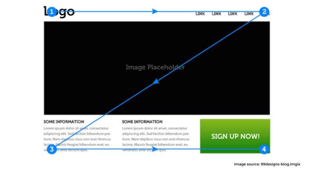
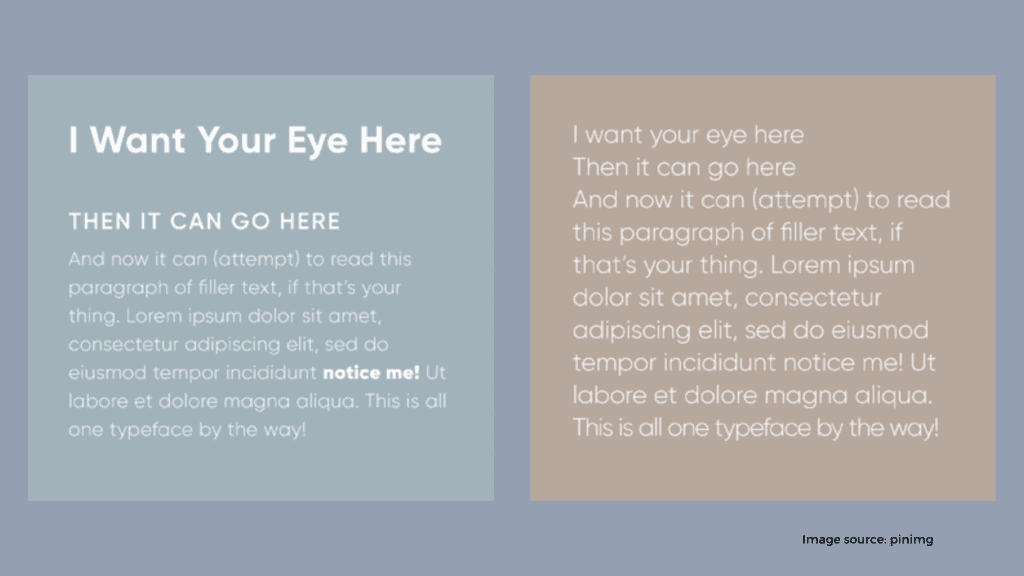
What do you think of “visual hierarchy” when it comes to using technical jargon such as “negative space”? It refers to manipulating what your user sees first, second, or last by employing various visual elements, such as size or location.
A good example of utilizing visual hierarchy to prioritize certain elements over others is a large, bold title at the top of the page and little legal information at the footer.
It’s not just what you put on your website but how you do it that counts. Take call to action buttons, for example; it’s not enough that they’re simply there. Skilled designers place them intentionally and give them bold colors to stand out and suggestive text to encourage more clicks. Just a few clicks from new visitors can go a long way in the design process.
Elements like size, placement, color, and negative space can all increase responsive design—or decrease it.
You can prioritize the following elements: the title, the images of the product, and the call to action. Provide visual cues to help users understand where they should look and what’s most important. Everything else, such as the navigation menu, the logos, the explanatory text—all can be secondary.
Do:
Don’t:
Now that you’re more familiar with the principles of good composition let’s discuss the details. We’ll start with color, which is an extremely important tool for any web designer.
For one thing, each color has its own set of emotional significance. For example, if your company’s personality is lively and energetic, a dynamic red would be preferable to a calm blue.
Aside from picking the greatest colors to represent your company, you must also use them effectively, such as contrasting hues to make your website visually prominent.
Many websites use the same hue to highlight keywords and buttons and incorporate them into the background pictures.
Do:
Don’t:
If you do decide to use real-life photography in your website design, be sure it’s done well. The ability to create effective, meaningful images may help you achieve your commercial objectives, but low-quality photographs prevent you from doing so.
The same rules for excellent photography, in general, apply to using photographs in web design.
A stunning photo displayed in an art gallery may be equally beautiful on a website, but the mood, style, and subject matter must be compatible.
Do:
Don’t:
While the words you or your copywriter select are extremely important, you may also improve their impact by using the right tone.
Typography consists of all the visuals of text, particularly fonts, other elements like size, text color, font style (italics, bold, etc.), and the spacing between letters, words, and lines. All of these impact your brand’s visual hierarchy and how it is seen. Typography is another one of those art forms that, like color and photography, has a wide range of styles. Choose the style that best matches your business.
Do:
Don’t:
Every individual has their own approach to navigating a website. However, navigation in a good web design is intuitive because it caters to the needs of its target audience—the lesser users have to think about it, the better.
But it isn’t simple. It begins with the site’s overall structure: what gets its own page, what is relegated to a subpage, what menu items it consists of, and so on. Before the web design takes off, each of these questions must be addressed. Visitors expect you to have a design for navigation that’s easy to use.
Do:
Don’t:
Older people are more likely to believe that web design is limited to desktop computers, but the fact is that most of their surfing takes place on mobile devices nowadays. That is why you should make sure your mobile site is up to date. The Google algorithm considers mobile responsive design when calculating their search engines’ ranking.
“Mobile responsive design” refers to how well your website is displayed on mobile devices, such as smartphones and tablets. This makes a huge difference if your website is restricted on mobile devices or images displayed incorrectly; your visitors won’t have a pleasant time using it.
Besides scroll, mobile devices come with a new set of design standards, such as “swipes,” so don’t expect your desktop version to translate automatically.
From the beginning, you should think about your mobile version. However, that doesn’t imply you can ignore your desktop version. On the contrary, your website should work with all sorts of devices to appear good, regardless of the device that they’re using to view it.
Do:
Don’t:
When we say a professional website should be easy to read, we’re talking about three different meanings:
Legibility is also determined by typography, but it must complement other factors such as composition and structure and how the text interacts with other components. Not to mention the quality of the actual writing.
Having a great website design won’t do you much good if no one can read your text.
Do:
Don’t:
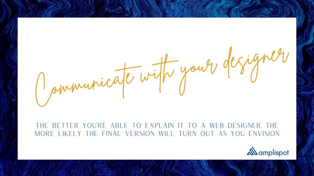
Let’s say you have a grand idea for a feature of your website, or you’ve gone through various articles about website design tips. But if you don’t explain it well, your designer might not understand what you actually want.
The better you’re able to explain it to a web designer, the more likely the final version will turn out as you envision.
Web design demands technical expertise because it’s a collaborative effort; it also requires communication abilities. In the end, a website is a two-way street.
The easiest approach to secure a web design you like is to communicate your objectives in detail. After all, web designers aren’t mind readers.
Do:
Don’t:
It’s one thing to read through these 10 website design tips, but it’s something entirely different to put them into practice on your site. Color theory, typography, composition, and mobile responsiveness are all quite complex, so don’t worry if you aren’t comprehending everything.
Professional designers can truly appreciate the distinctions of these areas. Therefore, hiring someone who understands these web design concepts is typically the most secure path to excellent design.
Everything you want on your website must be communicated and planned out carefully. It’s all connected, and a great website design considers all elements.
Use these 10 web design tips to establish a great foundation for your next website design.